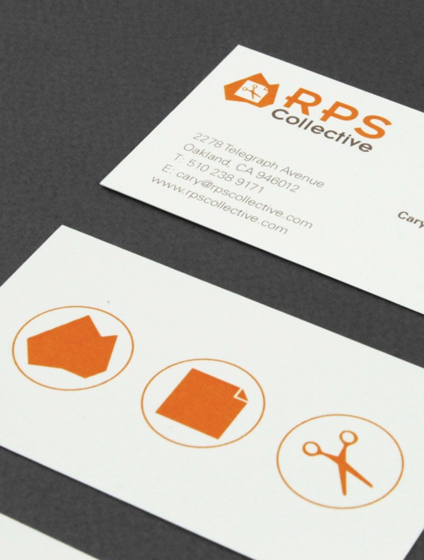
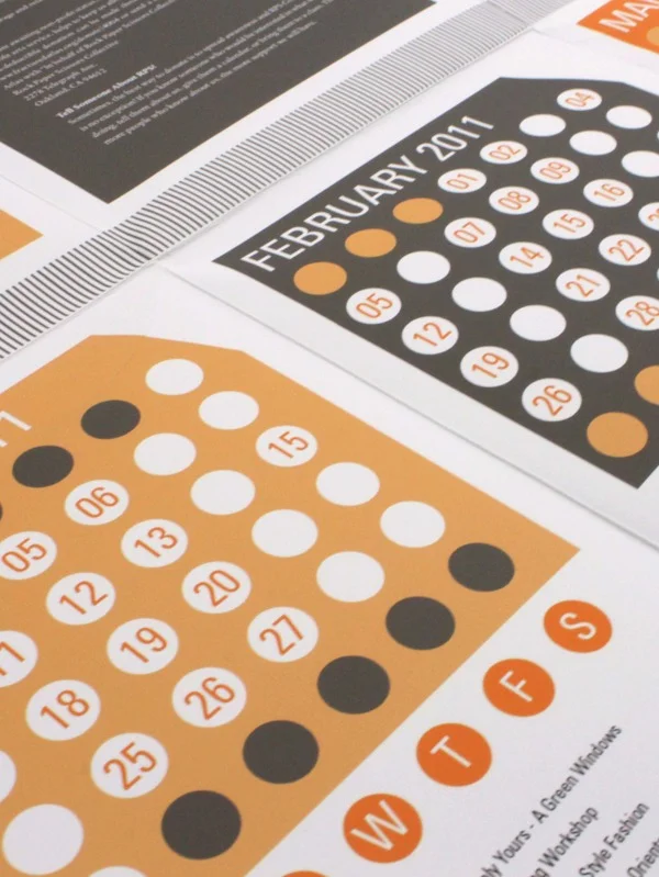
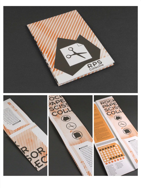
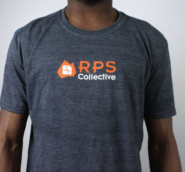
The Rock, Paper, Scissors Collective is a non-profit organization that promotes art and learning. Negative space was used in the logo rebrand to display the individual elements in the company's name. The grey in the brochure creates a contrast in colors that allows the orange logo to stand out and reiterates the playfulness of the corporation.



![shutterstock_100369046 [Converted].jpg](https://images.squarespace-cdn.com/content/v1/53dfe053e4b089342bba818d/1407190066635-OVSZ1QSGQ2M4TV8IABFQ/shutterstock_100369046+%5BConverted%5D.jpg)